
Logo design for the Polish Institute in Beijing
In January 2019 I was asked by the Polish Institute in Beijing to design a logo to commemorate “70 years of Polish-Chinese diplomatic cooperation”. I am very pleased that I have been so honored and that I can contribute to this initiative. Below are sketches I made for the IP. I am especially pleased of it, since I am a graduate of (among others) Comparative Civilization Studies at the Jagiellonian University, and Far Eastern culture was my specialty. I am glad that in this work I could use my knowledge from studies and my travels in Asia.
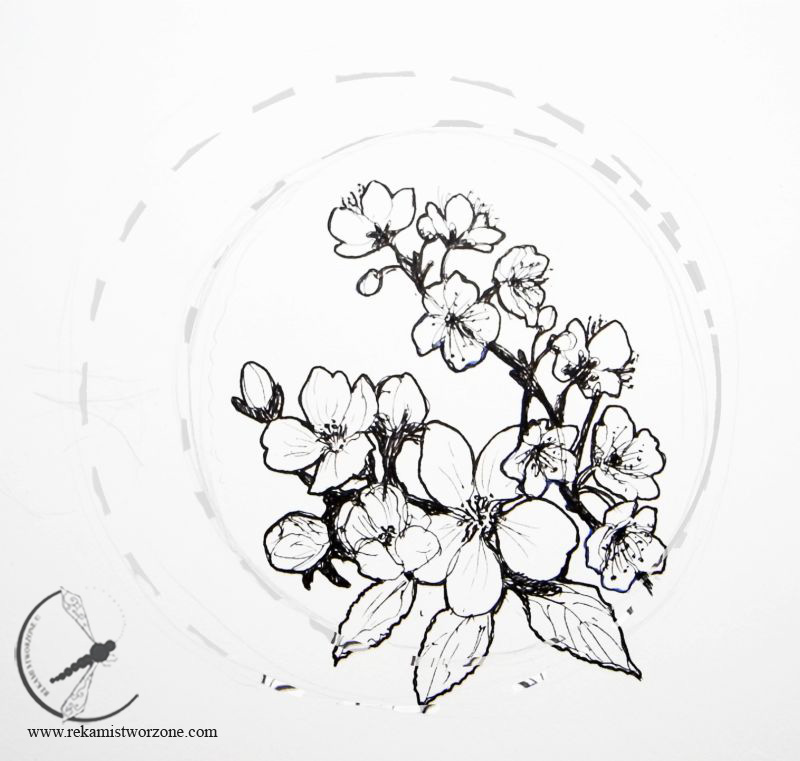
1. The concept of “Apple blossoms and plum blossoms” – often represented by Chinese painters and poets, being a symbol of boldness and courage and as a symbol of the Chinese nation itself. In 1911 plum blossom was chosen as a national flower. Its 5 petals, like the 5 colors of the first flag of the Republic of China, symbolized 5 nations: Han, Mongols, Manchurians, Mohammedans and Tibetans.
Apple blossom is an unofficial floral symbol of Poland, which right after the poppy flower is mentioned by most Poles.
Circles made with dashed lines suggest the target size of the logo (in 2 options: larger or smaller circle). I suggest placing the text with the circle line on the left side of the flowers.
Apple blossom is an unofficial floral symbol of Poland, which right after the poppy flower is mentioned by most Poles.
Circles made with dashed lines suggest the target size of the logo (in 2 options: larger or smaller circle). I suggest placing the text with the circle line on the left side of the flowers.
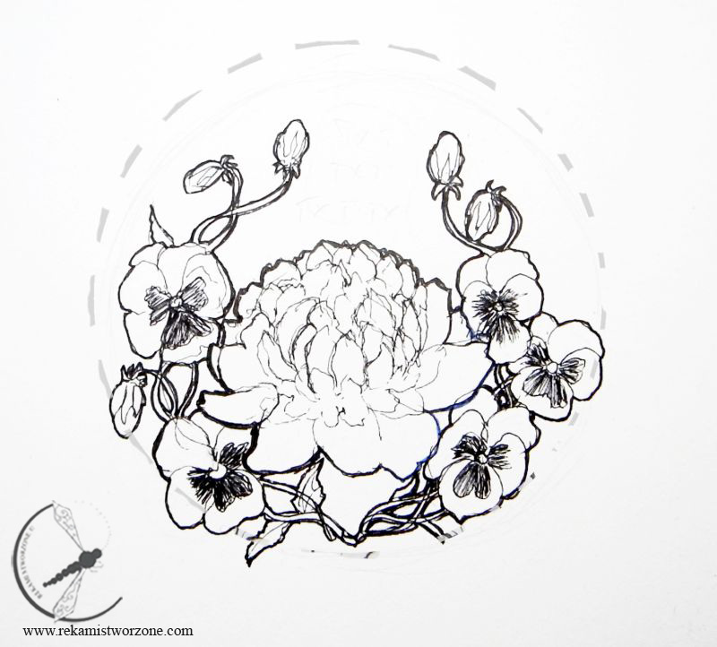
2. The concept of “Peony flower and pansies” – Peony is the most recognizable floral symbol of China. After talking with the artists in Kaifeng, I learned that, according to poets, “only something so full and so beautiful can be a symbol of China.” Depicted in the paintings – with colorful flowers and black leaves it means something noble.
Pansy is a symbol of Poland widespread in China.
The graphic form of the logo refers to the style of Art Nouveau, and in particular to Wyspiański’s stained glass (and wall decorations using pansies in the Franciscan Church in Krakow).
A circle made with dotted lines suggests the target size of the logo. I suggest placing the text centrally in the free space above the peony flower.
Pansy is a symbol of Poland widespread in China.
The graphic form of the logo refers to the style of Art Nouveau, and in particular to Wyspiański’s stained glass (and wall decorations using pansies in the Franciscan Church in Krakow).
A circle made with dotted lines suggests the target size of the logo. I suggest placing the text centrally in the free space above the peony flower.
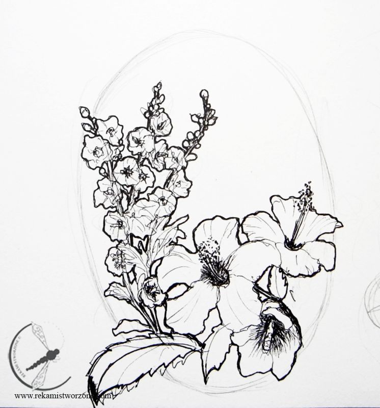
3. The concept of “Chinese rose (hibiscus) and mallow” – Hibiscus is a shrub known throughout the western world under the name “Chinese rose”. The moths have been part of the Polish landscape for centuries, which is evident even in painting. Hibiscus and mallow – although the first is a shrub and the second is an annual plant with a completely different shape, they have extremely similar flowers, because they are botanically from the same family.
The oval marked with a pencil indicates the target size of the logo. I suggest placing the text in the free space above the hibiscus flowers.
The oval marked with a pencil indicates the target size of the logo. I suggest placing the text in the free space above the hibiscus flowers.
Finally this design was selected:

During the implementation of the project, unfortunately, I found out that the idea of the whole undertaking changed a bit and my work will be used to create pins offered as a gift to guests of the Polish Institute and other personalities in China. The logo was taken over by some other idea.